I have been commenting on the equity market “melt up” for several quarters now. Since the end of the first quarter, this melt up has persisted and extended. Lately I’ve noted many other financial practitioners, commentators, and writers using the term “melt up” too. While its use is becoming more popular, I am not aware of a common definition. For me personally, I have used it to describe equity market returns that are characterized by small daily moves higher with limited downside and limited volatility.
It turns out the Sharpe ratio (developed by Nobel Laureate Bill Sharpe, PhD, Professor at Stanford University) is the perfect measure of “melt up” as I have defined it. The Sharpe ratio is a measure of a risky investment’s return (the asset’s return minus the risk free rate) over some specific period of time divided by its annualized volatility over that same period of time. In the context of melt up, the higher the Sharpe ratio, the more things are “melting up.”
Year-to-date, the S&P 500 Index is up 8 basis points per day on average (which translates into a 20% annual return) while its daily volatility is 42 basis points. These two data points translate into a year-todate annualized Sharpe ratio on the S&P 500 Index of a staggeringly high 3.50! To put this into proper perspective, most “good” investments produce long-term annualized Sharpe ratios that fall between .5 and 1.0. Any investment strategy delivering a long-term Sharpe of greater than 2.0 is considered genius. A 3.5 is insane and not likely sustainable over longer time horizons; particularly so for passive investments like the S&P 500 Index.
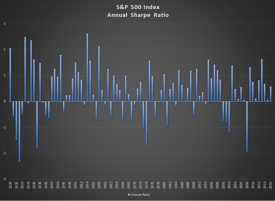
Interpreting the current Sharpe ratio in the context of its long-term range is vital to understanding the significance of what we are seeing today. Below is a chart of the calendar year Sharpe ratios for the S&P 500 Index from 1928 to 2016. The average Sharpe ratio using calendar year returns over this period is 0.4. We have no way of knowing now whether the S&P will complete the current calendar year on its current trajectory, but if it does, it will be the first time since 1928 that the annual Sharpe will be above 3.0. In my opinion, this is not likely to happen—not likely at all.
There are several observations from the chart above that are worth highlighting. First, the current streak of positive calendar year Sharpe’s without a negative Sharpe is the longest in history going back to 1928. Second, you have to go back to the mid 1990’s to find a period that is similar to what we are experiencing now. We all know what followed. Third, the Sharpe ratio in any calendar year has never exceeded 3.0.
Erik Ogard, CFA
Monea Investments, LLC
www.monea.com
Special contributor to aiSource

